


Anemoia Borealis was inspired by our custom paint color on the walls of our shop, which has become a signature color in our branding. A dark teal with so much depth that it changes color in the light, ranging from navy to purple to green, reminiscent of the Aurora Borealis. Here's the story:
I learned the hard way in the very early days of my interior design background that paint does unexpected things in different lights - and most of the time that was an unpleasant surprise. What I thought was a neutral beige turned purple in my first design project. A spa-like blue turned almost neon green in my second project. As I learned more about color and reflective values, I began working on a color for my own home that I could envision but couldn't find in any of the many swatches and samples I tried. Two months of adjusting and tweaking led to the teal that makes my heart go pitter patter in any light. The team at the paint store even high-fived each other in celebration when we finally got it right!
In 2021, a few short months later, we opened the doors to our first brick & mortar store and the natural choice for the wall color was my own custom creation. With the birth of Anemoia Mercantile (and my love for a good play on words), the color was coined "Anemoia Borealis".
As I was trying to grow the stationery and fountain pen side of the shoppe, I found Dominant Industry, who was also founded in 2021. In my talks with the CEO, I felt a bond with another newly-formed business with strong morals and values, and I mentioned in passing my desire to create a custom ink color. But as a baby business I was terrified to go out on that ledge, my inner critic telling me no one would care about my itty bitty business and its inspired color choices. Our itty bitty stationery section has since grown to about half of the store, and with the support of an ever-growing community (in the truest sense of the word) of pen and ink enthusiasts has formed, it has given me - not only the courage, but also the excitement - to take the leap! Thanks Anemoia Penablers!
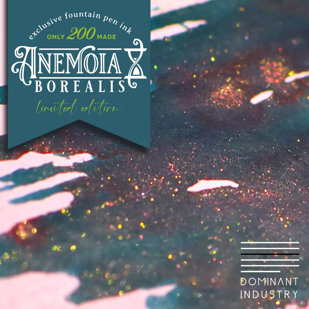
So I humbly present to you... Anemoia Borealis. A deep teal ink that shades into green and navy and purple, sheens a pinkish red, and sparkles with multi-colored shimmer light the stars in the night sky. Mindfully crafted in collaboration with Dominant Industry - a company whose values, business practices, and product quality I believe in, and with whom I truly enjoy working with.
Photos cannot capture the true depth of the color, but above is a picture of the wall in our first brick & mortar location that shows just some of the range of the color that inspired the ink.
About :
Dominant color in colorology - When the color scheme of a certain space and object is harmonized as a whole, it means the most dominant color among them.
Dominant Industry is designing colors with a focus on nature and seasons created by God rather than man-made artifacts. It contains the emotional colors of the season. We plan to return the colors of emotions that were missed in the seasons, not the colors of the seasons that everyone knows.
Dominant Industry Ink has a low acidity concentration. There are variations in each color, but the acidity value of the color with the highest acidity is the same as that of milk. The pearls we use are also made of eco-friendly materials, with small particles (50㎛) and low cohesion. Pearl series ink is also constantly working and researching to make it suitable for use with fountain pens.
Dominant Industry started in Paju South Korea 2021 and creates small batch, unique, and consistent inks that are a joy to write with. The bottle is one of the most unique and beautifully designed bottles we have seen, and the company is a joy to work with!


